What Should Be in a Proper Brand Book?

TL;DR: A brand book is a tool that ensures your company’s visuals look consistent across every channel. At a minimum, a brand book should outline the different logo versions, usage rules, corporate colors, and typography.
What is a Brand Book?
Let’s start by clarifying what a brand book actually is. Some call it a CVI (Corporate Visual Identity). Others call it a style guide or brand guidelines.
While one could argue there are subtle differences, for the sake of this article, let's simplify and talk about a practical, compact brand book.
It is a designed guide that establishes how a brand should look and defines the company's visual and communication rules.
If you are in the process of ordering a new logo or brand book for your company, this article will give you useful insights and ideas on what it should include.

What is the difference between a CVI and a Brand Book?
A CVI can be considered a more focused version of a brand book. A document focusing solely on design and visuals. A brand book, however, covers a broader scope. In addition to the logo and visual identity, it often describes brand strategy, tone of voice, photography style, and includes various design examples.
Why Should You Order a Brand Book?
Many entrepreneurs believe that a logo mark alone is sufficient. A high-quality logo is certainly necessary and a great start. If you want to know what makes a good company logo, read our logo design article.
But if you have a great logo, use it with respect. Your goal is for the logo to represent the company. You want it to stand out without "screaming." You want to look professional.
Beyond the logo, your company's impression is created through colors, graphic design, and imagery. When building a strong brand, consistency is key. This ensures your company gets noticed and is always recognizable.
Brand Book = Design Work Moves Faster
There is also a significant time-saving aspect to designing based on a CVI.
"Measure twice, cut once." Choosing suitable colors and fonts for design work from scratch takes a long time. Often, this leads to back-and-forth emails between the client and designer about what fits and what doesn't.
With a brand book, things are simple and clear. The elements are defined, allowing the focus to shift to creating the specific design at hand. This makes the designer's job faster and easier, allowing them to focus on what matters.
If a campaign message requires it, different fonts or thematic colors can always be tastefully introduced. For example, during Christmas. You might use a fancier calligraphic font in a headline or perhaps darker greens, blues, or reds. But in most cases, the corporate style should remain consistent.
You Avoid Problems
If your logo looks a different color in print, blurry on a website, or if long text makes it look weirdly small on a social media profile picture, the problem isn't always the logo. It's how it's being used.
A brand book removes all guesswork. It shows exactly how the logo, colors, and fonts must work in different situations.
A Professional CVI Gives a Company Three Things:
- Consistent appearance, regardless of whether an agency, freelancer, or marketing manager is doing the design.
- Clear files and rules, which rule out major visual errors.
- Confidence. The company looks strong and in control everywhere.
Below is a list of elements that should belong in a brand book.

1. The Primary Logo
The most important element is, naturally, the logo. I would compare it to a human fingerprint. A logo certainly doesn't have to tell the whole story of what the company does, but it is the cornerstone of the visual brand.
Usually, a company has one primary logo version that is preferred, along with alternative versions for flexible use. Some brands, however, have multiple equally usable versions.
2. Logo Variations: Black & White, Negative, and Icon
There can be several solutions for a logo. Simplified versions are often designed for complex, detail-rich logos. I won't list every possible solution here, but I will cover the main logo versions that may occur.

For example, with this Montreal gynecology clinic logo, we were dealing with a brand used simultaneously in two languages. That’s why we designed a unique and memorable symbol. No matter which language the logo is used in, it is always recognizable.
- Alternative version: E.g., horizontal or vertical layout.
- Monochrome (one-color) version of the primary logo.
- Monochrome dark (black) version for light backgrounds.
- Monochrome light (white) version for use on dark backgrounds.
- Logotype version (text only).
- Logomark without text: Avatars, favicons, etc.
Every version must be accompanied by an explanation of where to use it and why.
In the past, black logos were used mainly as an alternative when color printing wasn't technologically possible. Today, in my opinion, there are other reasons for using monochrome logos. For example, using the logo alongside other logos (e.g., in third-party ads, partner sections on websites, etc.).
That is why it is crucial that the logo is usable in a single color. In practice, monochrome logos are often used in various tones that match the design. You should account for the fact that your logo might be used in grays or colors that aren't your brand tones, and it must still maintain its character.
Logo Files Should Come with the Brand Book
A proper design agency always sends the finished logo in various file formats. In reality, designers would suffice with two vector format working files, but it is easier if other versions exist too. This way, the designer can use the most suitable file immediately, or you can forward the exact logo to partners.
I generally divide logos into two large groups: For Print and For Digital Use. I include all variations in both groups.
For Print: sent in CMYK color format (and Pantone for complex projects).
- Primary vector files: .ai or .eps
- Logo .pdf versions
- Logo files with background: .jpg format
For Digital Use: in RGB color format.
- Primary vector files: .ai
- Vector logos for web use: .svg
- Logo version without background: .png
- Logo versions with background: .jpg
3. Safe Area (Clear Space)
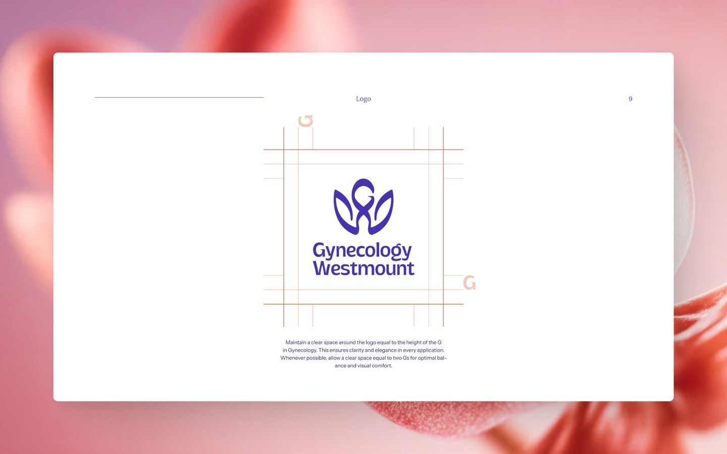
The safe area (or clear space) means the room that must always surround the logo. This prevents partners or media from placing their elements too close, causing the logo mark to lose its "breathing room." It ensures that different logos don't merge, and your logo stands out in the general design. Empty space helps create focus.
Usually, the rule is that the safe area is based on a part of the logo shape. For example, the height of the lowercase "x".
4. Logo Usage Rules
Using Logo Versions
We discussed different logo versions earlier. If these are in use, the brand book should clearly describe where and how they are used. Which version is preferred and when to switch.
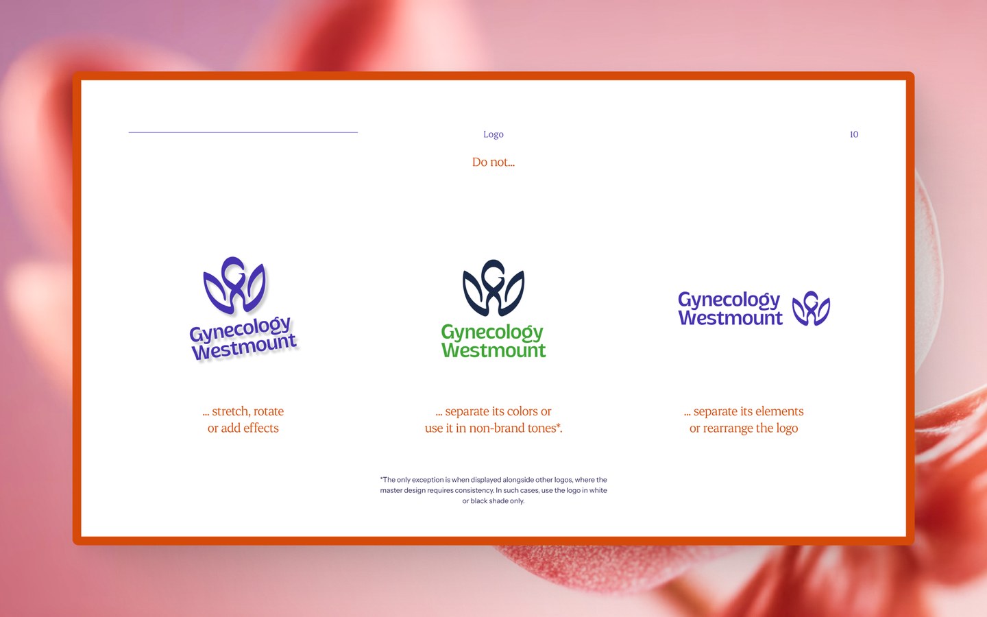
What Not to Do (Do’s and Don’ts)
Most brand books also show different versions of what not to do. Honestly, for a designer, this is always quite ironic. Yet, it could be considered one of the most practical parts.
The rule is that the logo mark must remain unchanged. Except for exceptions or when a "sub-logo" is designed based on the logo (e.g., a birthday logo or sub-brand).
But in reality, I often see these rules being broken. Outlines are added to logos. In worse cases, elements are moved around or colors are changed. This is definitely not necessary and makes no sense whatsoever.
With symbol-based logos, people even tend to change the font.
Which background or color combinations should the logo not be used with? The main rule here is logo visibility. If the background is cluttered, the logo won't stand out. Certain color combinations also have low contrast or simply don't match.
Logo Effects and Styles
Do not add effects like drop shadows to the logo. Sometimes it happens that you use the logo on a background and add a slight shadow for a more natural result, but generally, avoid it.
Stretching and Rotating the Logo
The same applies to rotating the logo. Brand books mostly state that this must not be done. In practical design work, however, you sometimes use the logo on a mockup and tilt it. Or add a slight texture to the logo so it looks more natural in the environment.
I definitely recommend following these "don't" rules very precisely, but you have to understand that sometimes, depending on the situation, they are broken. No one can define all these exceptions in a brand book.
Minimum Logo Size
Any logo becomes complex and unreadable when it's too small. Therefore, the CVI often determines:
- Minimum width/height for digital use.
- Minimum width/height for print use.
- Exceptions for small surfaces like pens, pins, stickers.
The minimum size recommendation must be specific, for example: "The minimum height of the logo in digital materials is 24 pixels."
5. Color Palette: CMYK, RGB, and HEX Codes
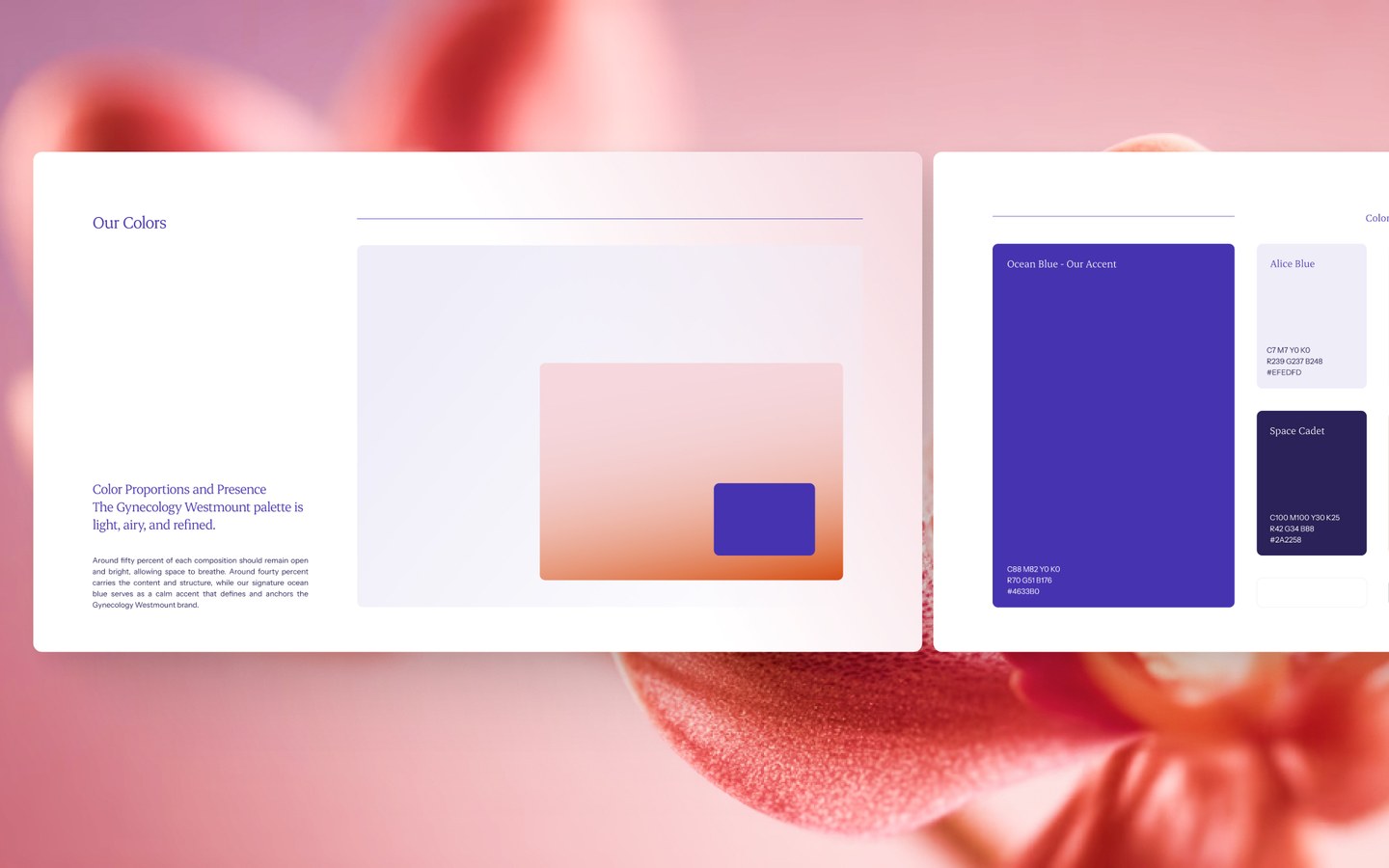
The color palette defines the brand. A simple color wheel isn't enough here. I could bet that if you see white and red, Coca-Cola comes to mind. Red and yellow lead your thoughts to McDonald's.
Colors are important for smaller companies too. While your color palette might not mean anything to someone on the other side of the world, you can stand out very strongly in your own market. A trailer painted in your colors drives by, and people immediately associate it with the right company brand. You don't always even need to see the logo.
A professional brand book contains:
- RGB and HEX values for screen-based designs (sometimes HSL, HSB, OKLCH).
- CMYK values for print.
- Pantone color codes, if used.
Without specific color usage, no company is visually consistent. CMYK and RGB differ significantly, so the CVI must determine exactly which color code is used on which platform.
6. Typography Rules
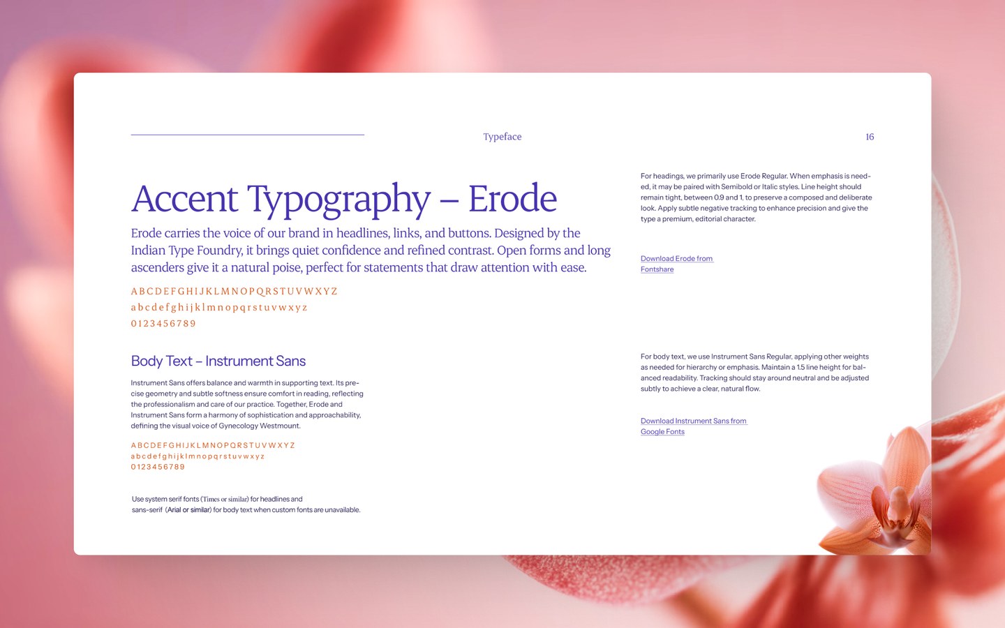
Typography determines the character of the brand. A brand book might include the following info about fonts:
- Heading font.
- Subheading font.
- Body text font.
- Alternative system fonts, in case the brand font isn't available.
- Typography scale.
- In some cases, line heights, font weights, letter spacing.
Additionally, there must be an explanation of how to use fonts in different channels. For example, is bold allowed in social media graphics? Are there exceptions for web use?
A good brand designer also thinks through special cases. For example, emails.
On the practical side, I must add that for small businesses, it's not worth overthinking this. I have encountered brand books made by top agencies where all font sizes are defined by formulas. In reality, you can't create a functioning system that fits a large outdoor billboard, an A4 poster, a website banner, and a tiny web ad simultaneously.
What do 90% of companies do wrong? They don't value good typography. Free fonts are often used. In reality, there is immense power in typefaces. Small details add a lot, and the right font character can bring a brand to life. Personally, I am a huge fan of wordmark-based logos. They are simple and actually work super well. The mood just has to be right.
7. Brand Visuals (Imagery)
If the brand uses photos or illustrations, their style is shown here.
- What lighting, tone, and composition to use.
- In what environment or activity photos are used.
- What the contrast and color usage should be.
Visual consistency comes from photography style just as much as from the logo, fonts, and colors. Sometimes brand book designers add a "Don't" chapter here. This usually includes very cheesy stock photos or examples of visual directions to avoid.
For a smaller brand book, this part can be omitted. Generally, it's worth viewing a brand book as an open document that is updated over time. If a photoshoot is planned, it's always worth talking to the brand designer to find a suitable style. Once photos are ready, they can be processed to fit and added to the brand book as examples.
In this case, the brand book also serves as a mood board for other photographers who might shoot in the future.
You can think even broader. Today you operate in Estonia, but if your company expands to France, Australia, or the USA, it makes sense to use a local photographer. And for them, the best input is a perfect brand book that sets expectations.
In 2026, when AI has become a popular tool in the visual world, a brand book might be supplemented with prompts. These would be instructions on how to generate suitable visuals for the brand in specific AI tools.
8. Design Principles
Here, general visual rules of the brand are brought out.
- Should the layout be dense or minimalist?
- Is the tonality calm or high-contrast?
- What is the grid or layout on main materials?
- What is the CTA style, button shape, and primary color?
This gives designers a clear direction so that all future materials follow the same rhythm.
9. Ads, Business Cards, Slides, and Other Graphic Design
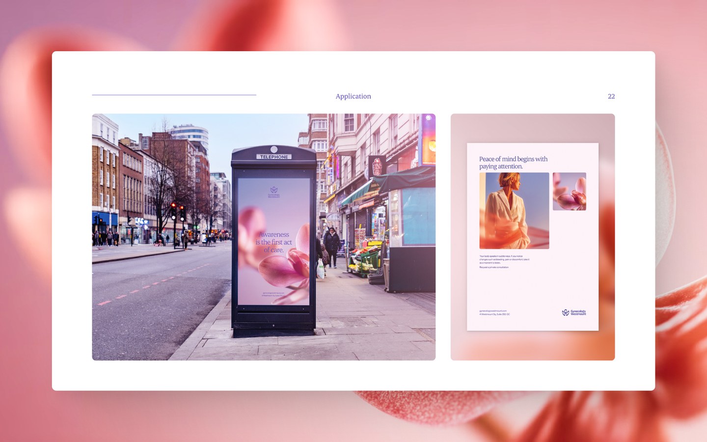
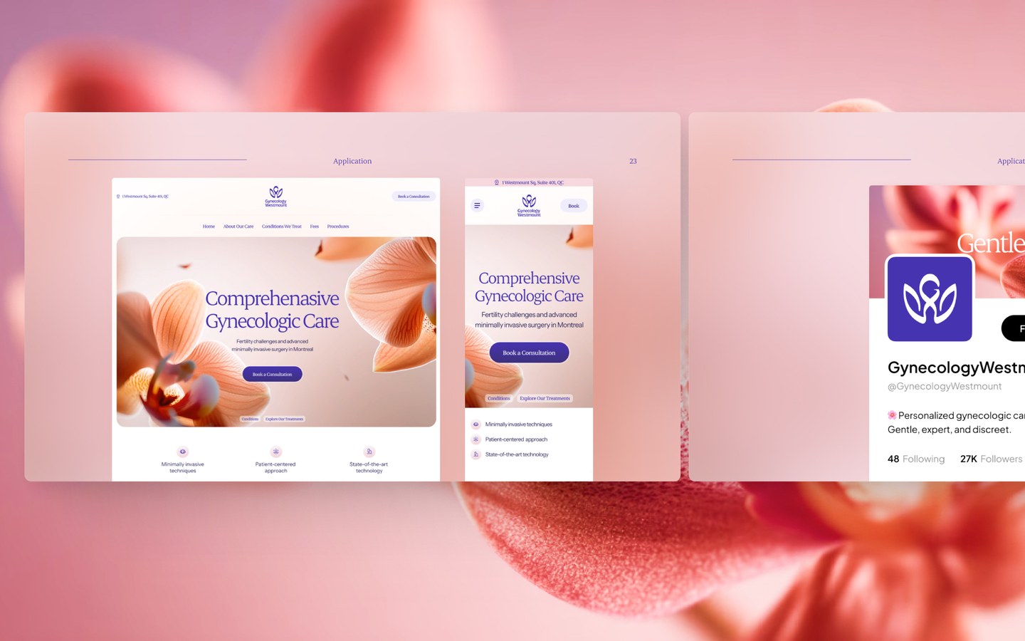
A CVI is not just theory. When creating a strong brand and brand book, various design solutions should be tested. Only then can you know if the logo and colors actually work. Can marketing present its messages with this grid and font sizes?
In practice, I have seen many brand books that are top-notch in terms of graphic design, but just a few weeks after the re-brand, the marketing department cannot stick to the rules written there. This helps no one.
Designers are confused. Marketing is unhappy. And the end result is quite messy. So, if you are already making a brand book, take it on properly and design all the necessary items. You save money, time, and get a better result.
Every larger brand book could include:
- Business card sample.
- PowerPoint or Google Slides master template.
- Email design sample.
- Email footer example.
- Social media post base style.
- Print designs and layout principles.
- Web banner examples.
- Social media frames + profiles.
- Website styling.
Applications show what the brand looks like in real life. They help all parties understand how the visual works in a real situation, not just on a white background.
If you already have a strong logo and brand designed but want to turn it into a modern website, read about making a website.
Again, for a smaller brand book, this might be left out. However, I always recommend adding anything that has been designed to the brand book.
One big problem I've noticed with marketing managers: They get tired of their brand first. What happens then? No one starts re-branding; instead, they just quietly move in a new direction. This is risky. If done consciously and the company works with, for example, one designer or a small agency, things might stay under control. But if there are multiple parties, the brand moves in several different directions. Eventually, there is confusion, and this costs the company money due to reduced visibility.
10. File Package and Structure

The brand book should also reference the file system you give to the client.
Recommended set:
- Vector files: AI, SVG, PDF.
- Raster files: PNG, JPG.
- Fonts or links to official font purchases.
- All colors: versions for print and digital.
- Design templates.
A good file package saves the client time and eliminates chaos.
11. Brand Values and Communication

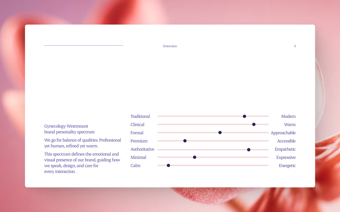
While a CVI focuses only on visual language, a brand book could also cover company values and communication language. Reading the brand book, one should understand how the company communicates and what its values are. These aspects are taken into account when creating various marketing and sales materials.
You can also add rules on how content or ad copy is created. What messages does the brand use? If you work with influencers or well-known people, what kind?
How Much Does a Brand Book Cost?
The price of a simpler brand book, including logo design, would start around 1200€ + VAT. This would include logo usage rules. If you need to think through brand archetypes and design various brand graphic design or web elements, the price depends on the exact volume of work. For premium brands, attention should also be paid to material selection and test prints to create a top-level brand identity.
See our logo design service page for more info.
A Well-Made CVI Is Not Just a "Pretty PDF," But Control Over the Company Brand
If the CVI is thorough and practical:
- The company is more impactful.
- Partners won't ruin your logo.
- Designers finish projects faster.
- Templates make work more comfortable.
- Every marketing material looks consistent.
- The company appears bigger, more professional, and confident.
A poorly made brand book is a mess where no one finds anything. A well-made CVI keeps the brand on track for years.
FAQ: About Brand Book Design
How much does a CVI cost?
The price for a simpler CVI starts at 1200€ + VAT, including logo design. Additional costs may apply, e.g., for fonts.
Why is a consistent brand important?
It's the 3, 7, 27 rule. A potential client needs to see your brand 3 times to recognize it. 7 times to remember it. And it takes 27 times to build trust and a desire to buy. Think about your own behavior. If a brand looks different everywhere, you are simply wasting opportunities.
Where should I order brand design?
You can order from us. Feel free to contact us. We listen to your ideas and offer solutions. This is free. I personally recommend using smaller agencies. Large agencies tend to do assembly-line work and cherry-pick which jobs go into their portfolio. Meaning, motivation is lower, and the bill is higher.
Is the brand book only for designers?
No. In fact, all company employees should have access to the brand book. It helps them better understand the essence of the company and the values offered. Additionally, it ensures that the company's visual identity is used as well as possible.
Are template logos and brand books okay too?
If you like them and feel they represent your company well, you can start with them. In the long run, I recommend having a designer look them over to truly adapt the template to your brand and target audience. Otherwise, you'll be just one among dozens of other companies using the same solution in a grey mass.
Want a Modern Minimalist Logo and Brand Book?
If your logo is outdated and your visuals work by "gut feeling" right now, I can help you design a compact and professional brand book. Complete with a file package, color system, logo versions, and examples.
Tell me what you have and what you feel you need. I will make you a compact CVI that solves 90 percent of visual messes. Write to me, and I'll tell you immediately if you need a small CVI or a larger brand book.
