What Makes a Good Logo Design?

Logo as Your Company’s Fingerprint
What is a logo? A logo is a symbol that identifies a brand. It usually consists of a typeface for the company name or trademark, which can include a symbol. Color—or the use of several colors—brings the logo to life.
There are no strict rules for what a logo must be, so nothing here is set in stone. Among designers, there are established opinions and best practices that a good logo should follow.
The visual side of a brand is typically the first or one of the first touchpoints for a customer. Maybe a friend tells you about a cool digital agency, but if you’re curious, you’ll end up googling them.
The first thing users notice is the visual design. The company logo usually sits in the upper left or center of a website, and in the Western world, that’s the most attention-grabbing spot.
People take less than half a second to form an opinion about your business. The logo and brand design (colors, fonts, styling, visual language) help users recognize your company and differentiate you from competitors.
Of course, evaluating logo quality is always a matter of taste. And with every logo project, the client should consider the designer’s style first and foremost.
In short, a logo is like your company’s fingerprint.
See some logos we’ve designed over the years.
A Good Logo Is Unique
A brand’s goal should be to stand out somehow. Sometimes standing out is more important, but every company should have a touch of uniqueness.
“The devil is in the details,” as they say. Details matter. Unique doesn’t mean the logo mark has to be as complex as possible.
Typography-Based Logo
A unique logo can be purely typographic, and the font doesn’t have to be obviously special. Even subtle details and the skilled use of fonts by a logo designer will leave a unique visual mark.
Larger companies will often invest in more expensive, custom, or perfect fonts—but usually, that has a bigger impact on broader branding and brand materials. You can also create your own type family.
This route is more common for big car brands, banks, shopping centers, and other international companies.
With many typographic logos I’ve designed, I’ve often combined different typefaces or tweaked letterforms specifically to create a unique and visually appealing result.
Logo designers who know their craft pick typefaces with a character that can sometimes convey a stronger message than the company name itself.

Logo Symbol
A logo can include a symbol. The symbol doesn’t have to directly relate to the company’s field. There are many ways to approach this. Many logos use a wordmark with a symbol, or just the symbol itself.
And there are brands that use the symbol alone. Two of the best-known examples are Apple (their logo appears much more often as a symbol and doesn’t literally depict a digital device—plus, it’s paired with product brands like “Apple + iPhone”) and Nike, which is almost always just a symbol.
Logo Versions
Some brands use different versions of their logo. Usually, graphic design agencies create a logo book or brand identity guide as part of a logo project.
This document shows at minimum the various ways the logo can be used and the brand colors.
If the logo has unique character and fits the brand, people will remember it better and the company will stand out.

A Good Logo Is Simple
Hellooo? Have you seen the Starbucks or Porsche logos? Exceptions don’t prove the rule. Car manufacturer logos really are an exception. But if you look closer at those complicated but famous brands, you’ll quickly see that
most actually use several different logos. Both Porsche and Starbucks have type-only versions too. Looking at logo design trends, you’ll notice that famous brands keep simplifying their logos over time.
We all recognize them instantly.
Good logos are generally as simple as possible. That’s purely practical. This way, the logo can be used at a reasonable size on the web, in mobile apps, or printed on a pen.
A simple logo is also more memorable.
A Good Logo Works in Different Sizes
If your logo is full of tiny details, you’ll quickly run into physical limitations on small surfaces. Think about mobile websites—a complicated logo would have to be displayed unnecessarily large, wasting screen space and breaking the site’s balance.
Vector Logos Scale
A good logo is always designed as a vector graphic. The advantage is that a logo built from mathematically connected points can be scaled infinitely without losing quality.
Sometimes, certain logo versions use raster graphics or even video elements. If the logo designer knows what they’re doing, this can work for the right project. But if a logo is in raster or full of effects, it usually means an inexperienced designer.
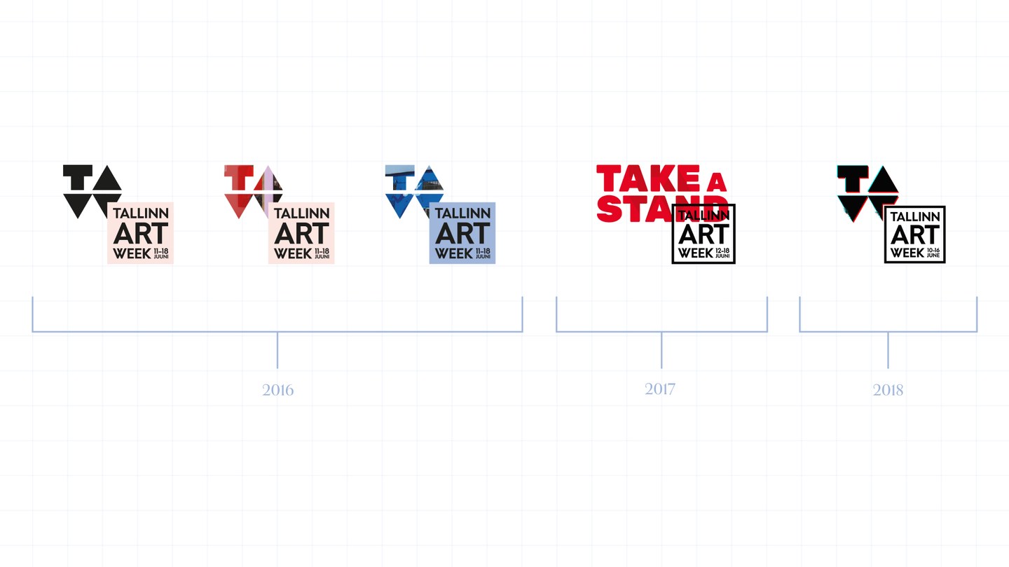
For example, the TallinnArtWeek logo I designed mixed raster and vector graphics. Because it was for a one-off event where usage could be tightly controlled, I believe it was the right call.

The same principle about logo size applies here. Many brands have created adaptive brand elements—different versions for different contexts.
For medium and small brands, using multiple logo versions isn’t always the smartest move. First, it takes more marketing to introduce and get people to remember more logos. Second, giving designers a choice of logo versions can lead to confusion and inconsistent branding.
A Good Logo Works in One Color
The main logo version might be colorful—think Google. The field you’re in and where the logo is used play a role. Digital products and services are often more colorful.
But a good logo must also work in one color, and be clearly distinguishable in black or white.
Back in the day, the need for black-and-white logos came from the complexity and cost of color printing. Today, there are other reasons. Logos are often shown alongside other brands. If every logo was a different color, the end result would look chaotic, so designers prefer one-color logos. If your logo has gradients or color fields that blend into a single color,
you risk a situation where a third-party designer doesn’t notice or handle it correctly.
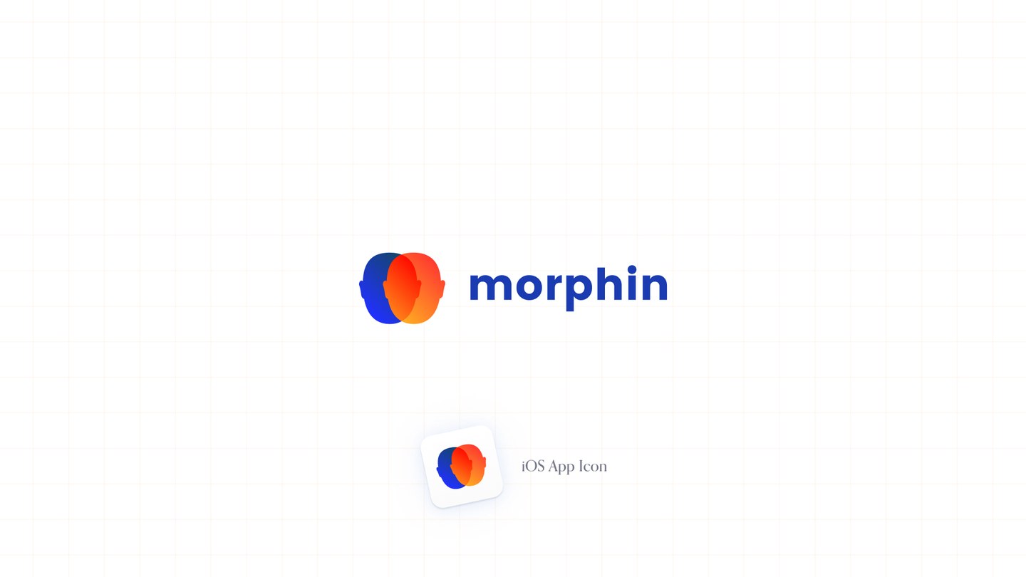
I’ll give an example. For Morphine’s logo, I used two overlapping heads. The app was using then-innovative technology and the logo, along with the iOS app icon, was designed to stand out digitally while staying simple. In the end, the logo also worked in monochrome, and the brand’s uniqueness still came through. I think these were the right calls—
and fun fact, the app icon even made it onto the stage at an Apple event.

A Good Logo Is Timeless
Design trends change every few years. It’s normal to redesign your website now and then, but your logo should last much longer. If you look back at the evolution of the Volkswagen logo,
you’ll see it gets simpler and more modern over time, but keeps its original idea and shape. Don’t be afraid to modernize your logo, but the core DNA should last for years—maybe decades.
Logo Usage Guidelines
This article makes it clear: a good logo can be used in a variety of ways. Maybe your logo is a typeface plus a symbol, and you use them together or separately. Maybe you use different color versions.
Best practice is to design a logo book (or “brandbook”) alongside the logo, setting out how to use it. Bigger companies call it CVI—Corporate Visual Identity.
A brandbook usually contains much more than just logo usage rules.
The goal of a brandbook is to make sure your brand is protected and used consistently. It’s a tool for designers and marketers.
In my experience, some brandbooks are huge but not actually helpful for designers. I’ll try to write more soon about what a good logo book should include, and what to keep in mind if you’re planning to commission one.
Frequently Asked Questions About Logo Design
How do you recognize a good logo in 2025?
A good logo stands out for its simplicity, uniqueness, and versatility at any size or color. If your logo works well online and in print, is timeless, and builds brand recognition—that’s what today’s businesses value most.
How many logo versions should you request?
I recommend at least two: a main (full-color) version and a single-color (black or white) version. You may also need an “icon” version for tiny squares like social media profiles, app icons, or favicons.
How long does logo design take?
Typical logo design takes 1–3 weeks, depending on your needs and how fast you give feedback. It can be rushed, but for quality results, allow a couple of weeks. Bigger or more complex projects take longer.
Does logo design include a brandbook?
Yes—a logo design project should include at least a mini-brandbook that covers logo usage rules, color codes, fonts, and logo use cases.
What should you think through before ordering a logo?
Think about how you want your business to stand out, who the logo is for, and where you’ll use it. The more clearly you define your needs and goals at the start, the better the result!

Now You Know What Makes a Good Logo
To sum up—most graphic designers and logo creators would agree that a good logo is:
- unique
- simple
- works in one color
- works even at small sizes
If you’re building a new business or feel your current logo doesn’t tick all these boxes, Give can help create a minimalist and strong brand identity.
Check out our logo design service page for details.
If you already know you need this service, you’ll find the contact button in the footer.
