Design Sprint – One Week to a Logo and Landing Page UI/UX Design
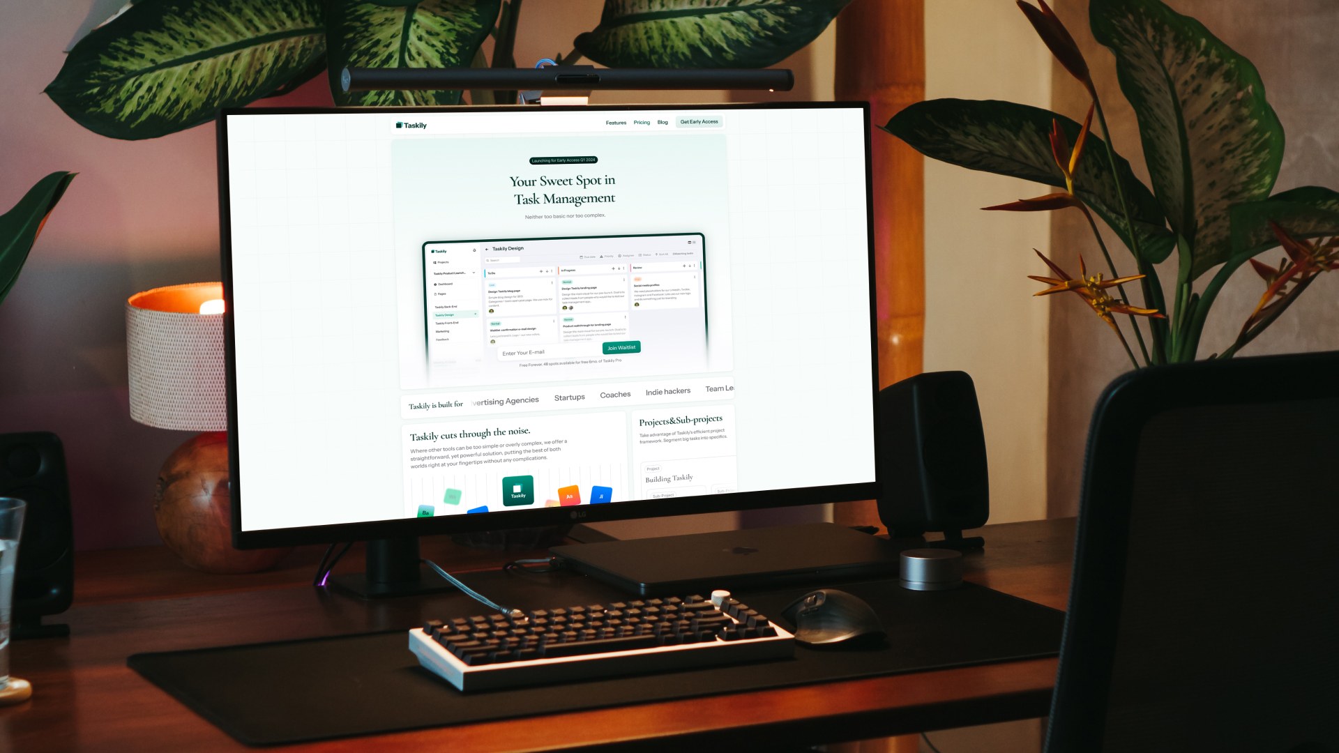
What is Taskily?
Taskily is a Latvian startup building a new task and project management tool. Think something between Basecamp, Trello, Linear, Asana, or Jira. Their goal? To carve out a spot between the big names—offering enough functionality, but keeping things simple.
Naturally, there's a touch of AI built in to streamline the experience. The product is still in development and not yet publicly available, but after testing it, I can say it has strong potential.
Taskily had no logo. No designer. Just an idea—and a product still under wraps.
Since the current team is made up entirely of developers, I was asked to consult on the website design and UI/UX direction. Co-founder Jim Dreyer approached me with a question: could I help them take a step forward in design? To give Taskily a sharper, more professional look and explain the product better. Of course. I love working with early-stage startups where good design brings fast, visible results.
A One-Week Design Sprint
With the product still in development, Taskily's site is currently a simple landing page used to collect emails and build interest. Our main focus was improving the layout and design to feel clearer and more trustworthy.
There was more we could’ve tackled, but as with most pre-revenue startups, budget limits required tight focus.
That’s exactly where Give excels—we’re one of the best design partners for early-stage startups. We bring solid experience, flexibility, and modern design—within reason.
The task was to make the landing page more intuitive and visually credible. Normally, landing pages aren’t huge projects. But this time, there were no logos, colors, typography, or visual assets to work from. The sprint scope had to stretch.
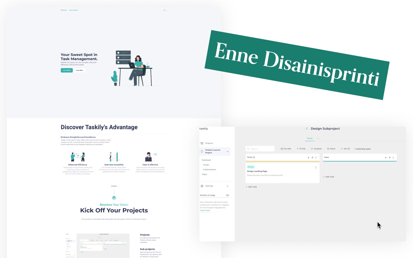
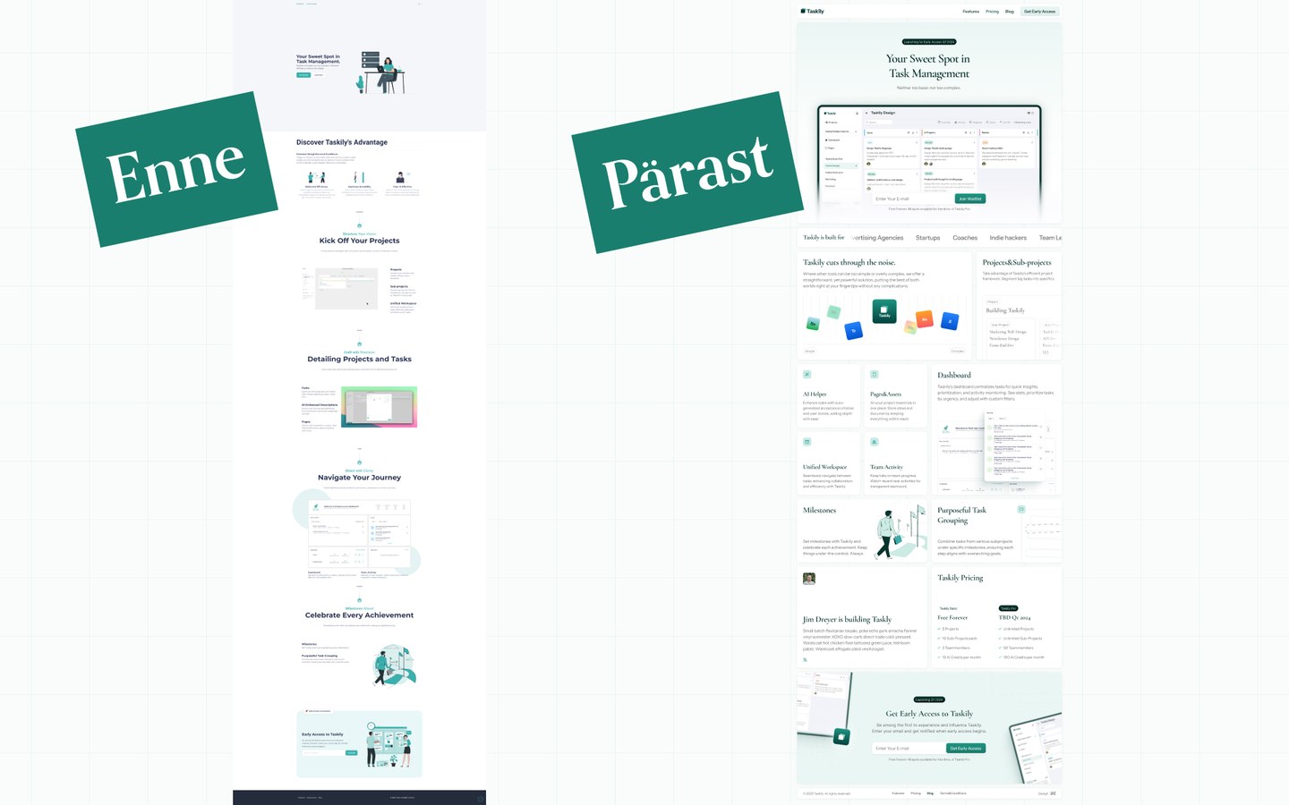
For context: the sprint began on Monday, October 23, 2023. Here’s how the Taskily site and SaaS dashboard looked before we started:
Designing a Logo for a SaaS Brand
Taskily had no logo—actually, no brand at all. They had a basic template-based site with greenish-blue buttons and illustrations.
Normally, branding starts with research. But since I’ve worked with many project management tools over the years, I leaned on experience rather than doing fresh discovery (given the time constraints).
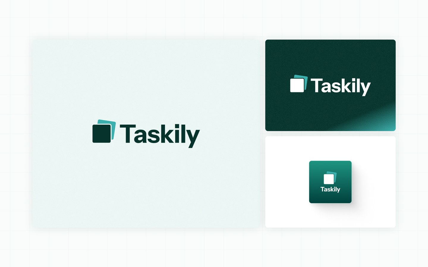
I designed several logo concepts, but only showed the client one—there wasn’t time for back-and-forth. They had to decide quickly whether it worked. Luckily, it did.
By Tuesday evening, the logo was locked in. I chose green as the brand color—trustworthy and flexible, and a little less overused than blue or purple right now.
We can help your brand too: logo design services.
Redesigning the SaaS Dashboard UI/UX
Since Taskily is a web-based SaaS tool, I knew that showing the product UI clearly on the site would be key.
There were three options: use in-progress screenshots, design new views, or rely on abstract illustrations. At first, I wasn’t sure.
Existing screenshots limited the visual language of the new site. To make them fit well, the entire site would have to mimic their style—which felt outdated.
Illustrations were another option, but:
- I’m not an illustrator.
- Hiring one wasn’t realistic in this timeframe.
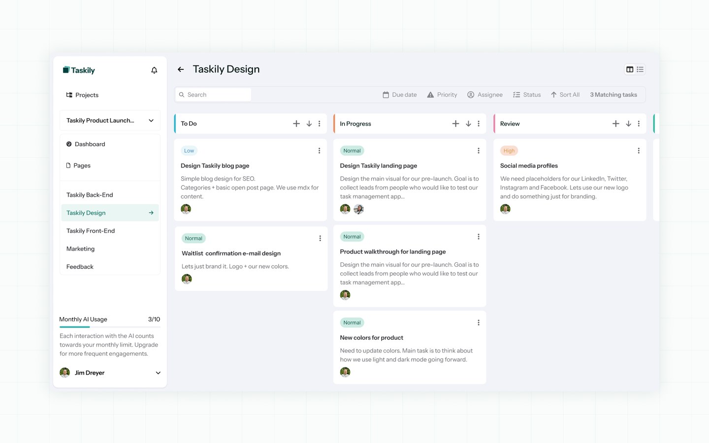
So I decided to use part of the sprint to redesign the key SaaS dashboard views. This also gave Taskily fresh input on their product.
UX Improvements
I wasn’t redesigning the product from scratch. But I flagged a few usability issues and improved them while giving the UI a more modern feel.
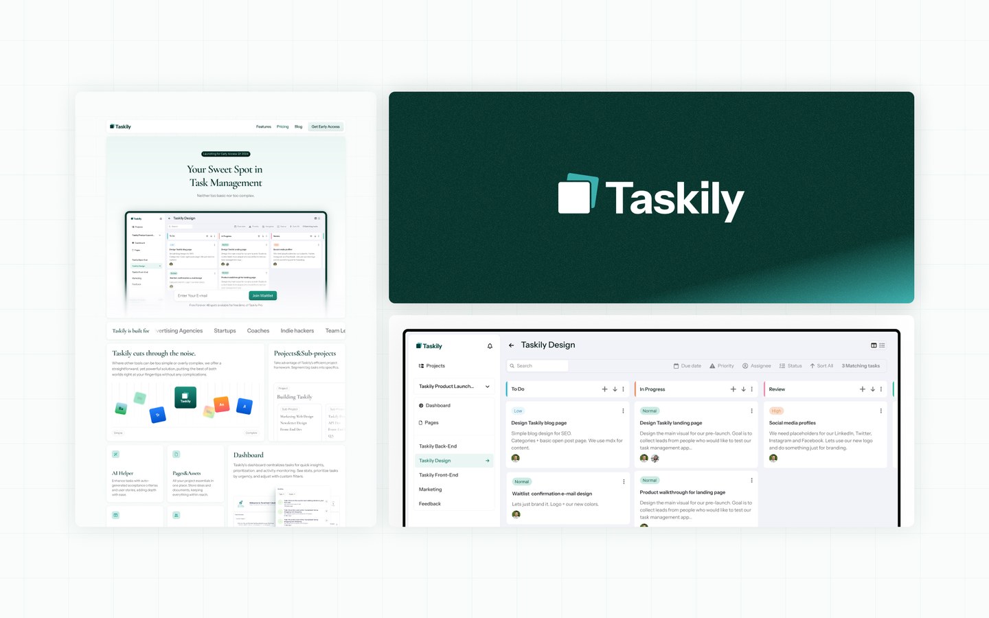
Here’s where we ended up:
Designing the Landing Page
With the logo and dashboard UI ready, it was time to design the landing page. We stuck to the existing copy with only minor edits for clarity and structure.
Our design sprint goals:
- Present the product more clearly
- Build visual trust
- Collect leads from interested users
In Figma, I explored fonts, colors, layout, and visual structure. By Wednesday afternoon, I presented the first landing page draft:
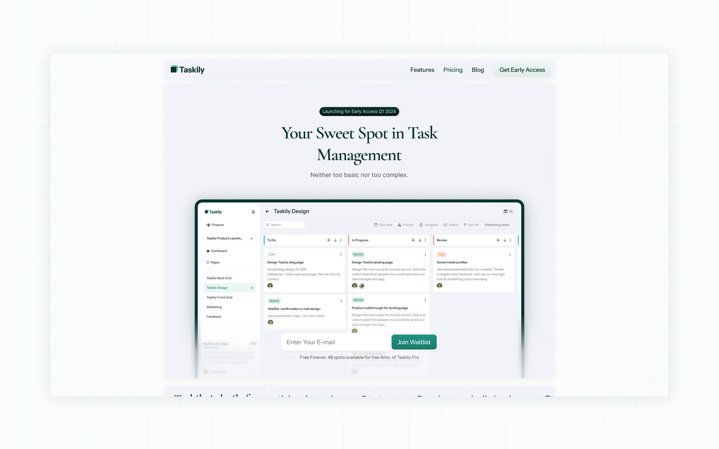

"Well, you got me smiling 👍 I can't understand though If I'm a fan of that font, but overall I think I like it quite much so far."
Not bad! Presenting the first draft is always a big moment—especially with new clients.
The design was a bit unconventional and stood out from typical SaaS pages. It’s always great working with founders who understand why they’ve hired a designer—and can trust the process.
Layout and Structure
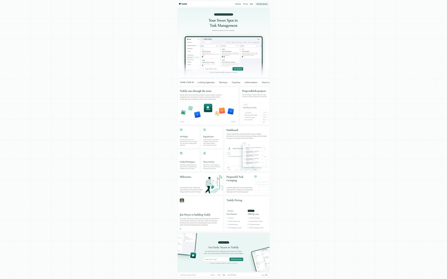
Most SaaS landing pages follow a predictable format. But because Taskily wasn’t yet public, we couldn’t rely on user quotes or measurable value props. We used a full-page “bento grid” layout instead of just one bento section. It created a sense of organized variety—interesting to explore and digest, especially with short copy.
Visual Design and Color
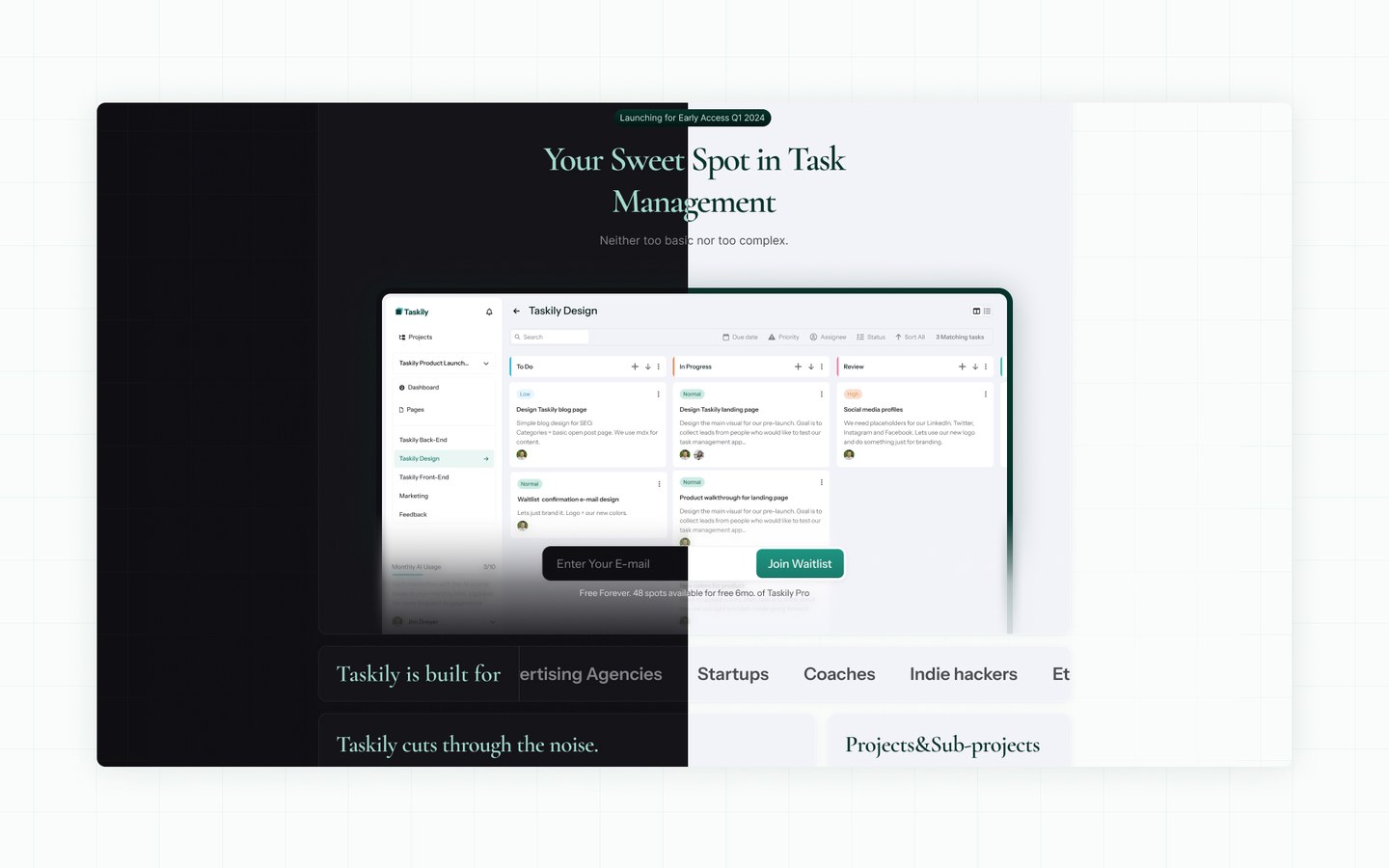
I wanted to flip convention on its head. Normally, lighter elements float on darker backgrounds. That’s how real-world light works. But for this site, we reversed it: light background, dark feature cards. Was it right? Hard to say. More on that later. We used the new Harmony color palette—clean, accessible, and just released.
Typography
I chose Cormorant Garamond for headlines. A serif Google Font that felt trustworthy and editorial. The client had some doubts initially, so we also tested sans-serif fonts. In the end, we shipped with the serif version.
Why?
- Serif fonts evoke trust and expertise—good match for a PM tool.
- The contrast between serif headlines and sans-serif body text added character.
- 95% of sites avoid serif—this one stood out.
Light and Dark UI Design
The Taskily app includes light and dark modes. Initially, we thought of doing both for the site too—but scrapped the idea due to the extra design, development and image work it would require. Still, the design is flexible enough to support both if needed later.
UI Details and Finishing Touches
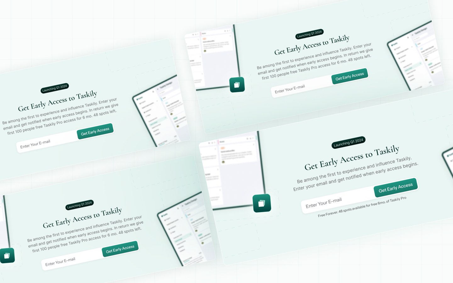
Good UI is made of small decisions: 8px here, a line break there.
Design sprint doesn’t aim for pixel-perfect perfection—but it pushes you to work fast and smart. And often, that leads to better decisions.
Two Designers Are Better Than One
I asked another UI/UX expert for feedback. Their input helped refine key areas. Client feedback made me rethink the color direction—we ended up switching to a more familiar, friendly tone. Throughout the design phase you are required to make thousands of decisions.
When doing a sprint, there’s no time to explore every option. That’s why experience matters—you need a designer who can decide fast, and get it right.

UI Components
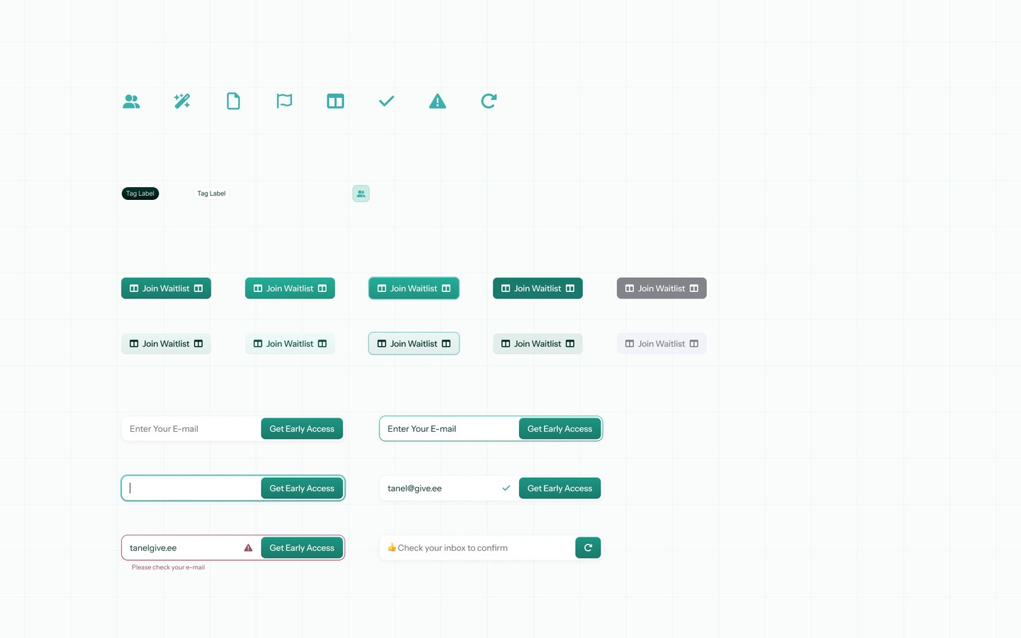
Designing a landing page also means thinking about hover states, form validation, and interaction patterns. Once the main visual style was approved, I created a mini UI kit in Figma so frontend developers could build quickly.
Responsive Design
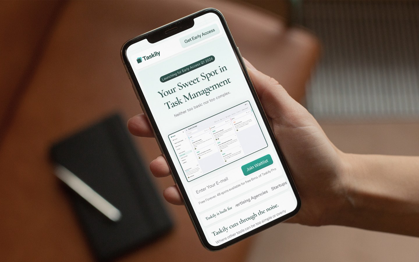
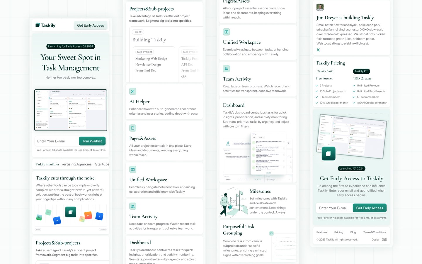
Mobile users matter. A lot. In 2025 60%+ of your traffic might come from mobile devices. Approved layout was adapted for smaller screens so that the developer would know exactly how to implement responsive breakpoints.
What We Achieved in One Week
In one week, Taskily got:
- A new logo
- A modern landing page
- A refreshed SaaS dashboard UI concept
Client Testimonial
When I approached Tanel, I had only a vague idea for my landing page based on Taskily's positioning. From the outset, his expertise was evident. The end product far exceeded my expectations, with every detail being spot on. He didn't stop there; he proactively updated and refined it, elevating the design even further. Throughout the project, responses were prompt and he was always up for a discussion. Working with him was not just about his skills, but also the genuine pleasure of the collaboration.

3 Things Founders Can Steal From This Design Sprint
- Don’t wait for a perfect product to start looking sharp.
- Landing pages can sell a feeling before a feature.
- Fast ui/UX design decisions beat endless polish.
Final Thoughts on Taskily Design Sprint
This sprint went well. But usually, I recommend focusing on one core area at a time—not multiple design streams at once. If possible, stretch a sprint over 2–3 weeks. That gives room for feedback and polish without burnout.
Keep the decision-makers few. Otherwise, alignment becomes a bottleneck.
Design sprints aren’t for building the final ui/ux designs. They’re for clarity. Direction. Momentum. Even concept work can unlock next steps, help you understand your brand better, or test ideas with users.
In five days, Taskily didn’t just look like a startup. They looked like a funded one.
If you need help with website design or landing page UI — get in touch.
