Website Conversion Rate Optimization for a Private Medical Clinic
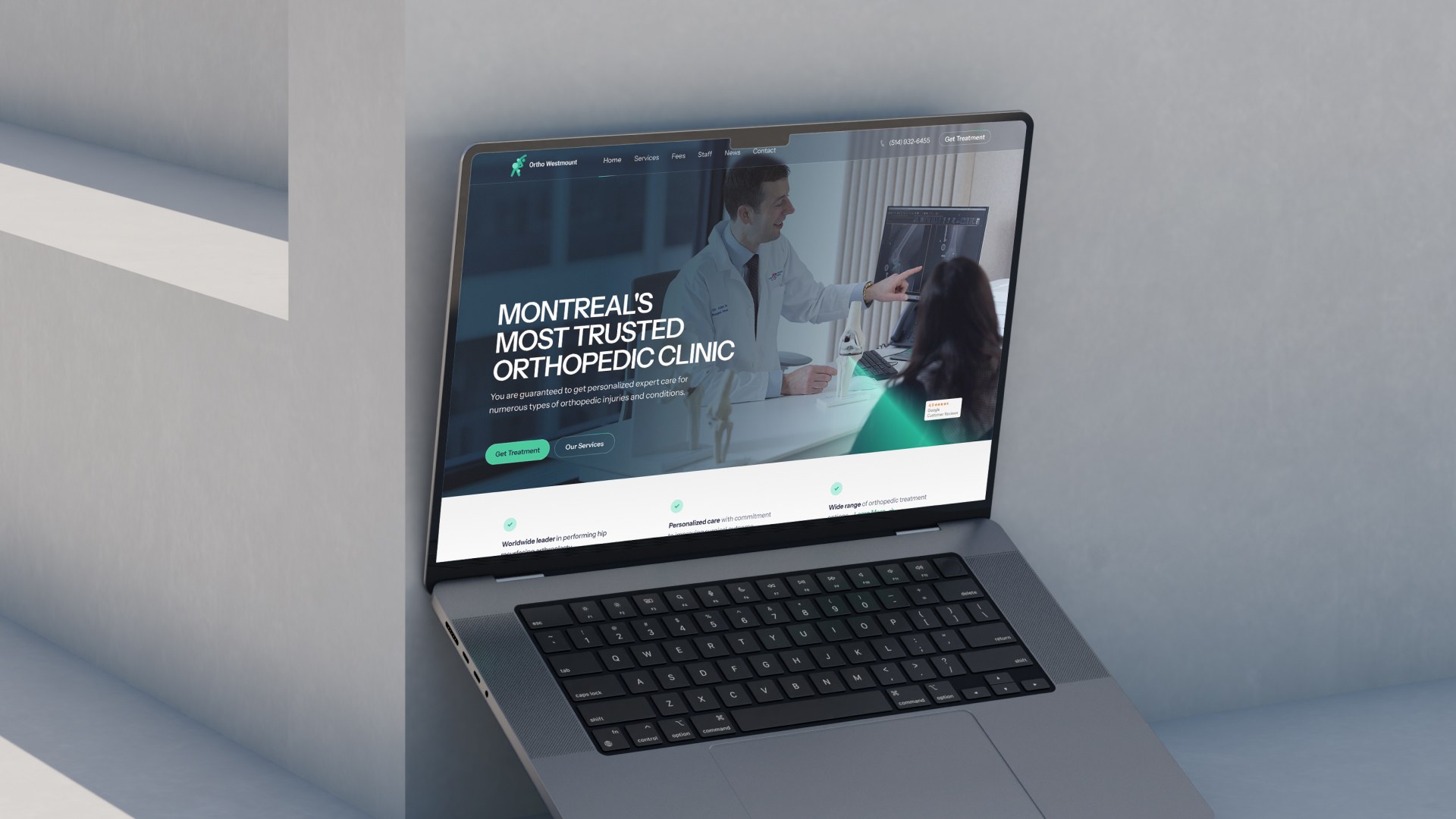
Designing Trust: Improving Conversion Rates for a Medical Website
Every website needs a few basics in place before it can convert visitors into clients. First, it must function correctly and clearly explain what’s on offer. Second, there needs to be a real demand or interest in that product or service. And third? Trust. Especially when it comes to private healthcare.
You’ve probably noticed that the more questionable online offers — miracle vitamins, instant wealth, get-fit-fast programs — often have outdated, even ugly websites. That’s intentional. They want to attract impulse buyers and discourage critical thinking.
But the average person? They judge heavily based on visual trust signals. Especially when it comes to medical websites, where trust is everything. This is even more true in markets like Canada, where private clinics compete directly for patients’ out-of-pocket spending.
So unlike traditional conversion rate optimization (CRO), here we’re not trying to create FOMO. We’re assuming the visitor already needs this service. Now it’s about helping them feel safe choosing you.
Starting With Assumptions
Before we redesigned this private orthopedic clinic’s website, we made a few educated guesses:
- The user has a health concern and is actively looking for a solution.
- This is not an emotional impulse purchase. They’ll compare clinics.
- Location matters. This audience isn’t likely to fly in for surgery.
- Personal branding matters — especially the trust and credibility of individual doctors.
- The more professional and credible the brand feels, the easier the decision becomes.
What We Changed to Improve Conversions
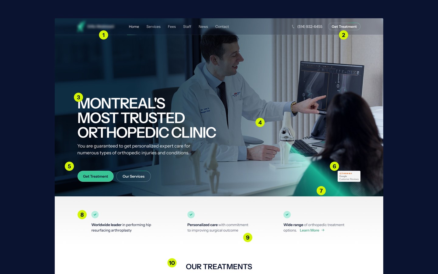
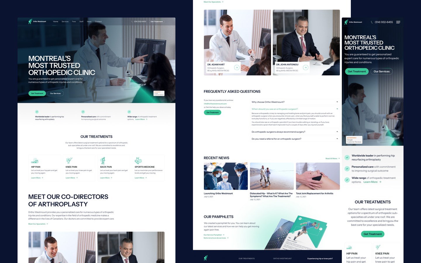
While we redesigned the entire site, this post focuses on the desktop layout and header section — where many first impressions are formed. Let’s break it down, point by point.
1. A More Modern Visual Style
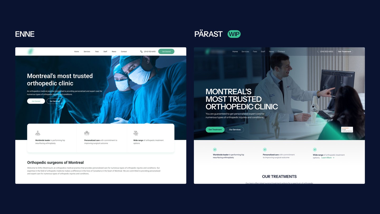
We gave the entire site a design refresh. Why? Because visual design is a trust signal. A clean, up-to-date look instantly communicates that your clinic is modern, professional, and detail-oriented.
2. Stronger Call-to-Actions (CTAs)
We changed the button text. Instead of vague “Start” labels, we shifted to outcomes like “Get Help.” Button copy is one of the simplest ways to A/B test your way to better conversions. What works best will always depend on data — but starting strong helps.
3. Updated Typography
We introduced the Instrument Sans font — clean, slightly technical, and highly readable. It feels modern and trustworthy. We also used ALL CAPS in headings. Normally, that can hurt readability, but here it made the messages bolder and easier to read for older users.
4. Real, High-Quality Photos
Stock photos and AI-generated images can’t compete with the trust-building power of real photography. We used professional, clinic-specific images that reflect modern equipment and include the patient as an empowered participant — not just someone being operated on.
(For example, we removed an image showing a scalpel in action. It may have been accurate… but didn’t feel reassuring.)
5. Better CTA Button Placement
Previously, there were two primary CTA buttons — with the top one being too dominant. But heatmaps and analytics tell us that users don’t often click header buttons. Most clicks happen further down, within content. So we rebalanced things.
We also improved color contrast, made sure buttons passed WCAG accessibility standards, and ensured text stayed readable even on image backgrounds.
6. Showcasing 4.9-Star Google Reviews
That’s a fantastic rating — and the old website didn’t show it at all. Transparent reviews build trust fast. We added this prominently to help reassure hesitant visitors.
7. Trust in the Details
Many healthcare websites follow a familiar look — clean, white backgrounds with blue or green tones. That’s not a flaw. It’s actually expected.
This isn’t the place for wild creative experiments. You wouldn’t want surgery from a doctor who’s “trying something new.” The design should reflect the same values the clinic holds: reliability, care, and precision.
We added a subtle green laser motif — a nod to modern medical technology. It’s quiet, stylish, and adds character without overwhelming the layout.
8. Smarter Use of Icons
Icons should clarify, not distract. The old design used playful icons that felt a bit too lighthearted for serious medical services. We removed those and introduced more neutral, trust-building icons where needed. The result: calmer, clearer communication.
9. Clean, Confident Web Design
The new design feels modern, but not cold. It’s not overloaded with animations or flashy effects. It’s just a good-looking, easy-to-use medical website. That’s what people want.
10. Consistency Across Pages
We committed to a design system — same headline styles, same spacing rules, same component behavior — and stuck with it across the homepage and subpages. Visual consistency creates comfort and confidence.
What Happened to the Conversion Rate?
Before the redesign, the conversion rate was 0.72%. After: 1.5%. That’s more than double.
Some of my clients have seen 10%+ conversion rates — but let’s add an asterisk. That’s usually for highly targeted campaigns (like email lists landing on specific landing pages).
So traffic quality matters a lot.
Equally important? First impressions. A good website design instantly builds credibility. In fact, of all the things you can do to improve conversions, design is often the easiest win.
From there, the message matters: clear copy, strong CTAs, no confusion. Your site’s content and design need to work together like a team.
And don’t forget to look beyond the numbers. Sometimes it's easy to boost conversion rates with a trick — but if those leads are low quality, you're wasting time. Good design brings better leads, reduces friction, and saves your team time by filtering out tire-kickers.
Want to go deeper into this? Check out our post on Psychology in Web Design.
Start With a Website Audit
Not sure where to begin? Start with a conversion-focused audit. Try this tool: https://kodulehekriitika.framer.website/
You won’t get final design files or content rewrites — but you will get an expert’s eye on what’s likely holding your website back.
Websites are like cities — they’re never really finished. There’s always something to test, tweak, or improve. Especially in today’s fast-moving digital world.
Optimizing your website helps you serve your users better, understand their needs more clearly, and in some cases… even unlock new, more profitable business models.
Need Help With a Website Redesign or Conversion Optimization?
A professionally designed, conversion-optimized website can easily deliver 2–3x more leads — with the exact same traffic.
With highly targeted traffic, we’ve seen conversion rates reach 25%. (That means one in four visitors submits a contact form or books a consultation.)
